
Overview
"Lets redesign our main product"
This was my challange for the quarter.
Core Issue
The product has grown organically without a designer over years, resulting in:
Inconsistent UI patterns
UI created by multiple designers/engineers
Fragmented workflows
And a few lead to nowhere
Steep Learning Curve
To hard to do things
Strategy
Redesign with UX
User Research
Validate that redesign isn't based on intern opinion only
Usability Testing
Test with real users before ready for development
Incremental Redesign
Release features progressively
Design System Update
Maintain consistency at scale
Success Metrics
Define measurable outcomes
Feedback Loop
Continuously collect user feedback and comunicate with them
Accessibility
Ensure usability for everyone
Change Management
Let users go back and forth from old to new UI
Beta Program
Start small with power users early
Objectives
What we want to achieve
UI
Update visual design for a modern UI
No errors
Zero broken flows.
Task Completion
Reduce task completion time.
Feature Adoption
Increase feature adoption for underused tools.
Fast Onboarding
Decrease onboarding time for new users.
Reduce cognitive load
By mapping information architecture
Survey
I sent an email asking for users to provide their options regard current dashboards
User Story
"I want to preview dashboard changes before applying them."
Method
1 to 5 Rate Scale
Participants
Borader user base (500+)
1. How satisfied are you with the dashboard types
2. How important is customization to you?
3. How do you evaluate our current visual design?
4. For a new user, how easy is it to use dashboards?
5. How easy do you think it is to start using dashboards?
Usability Inquiry
Looking on how users set up and interact with their dashboards.
User Story
"I need a dark mode to match my clients visual design"
Method
Monitor Screen Activity through FullStory App
Participants
Borader user base (500+)
Setup
Users strugle to start
Lack of templates and guidance
Data Integration
Unreliable and manual
Sync issues
Customization
Too Complex
Overwhelming options
Navigation
Hard to move between sections
Low discoverability
Clustered navigation
Impact on Experience
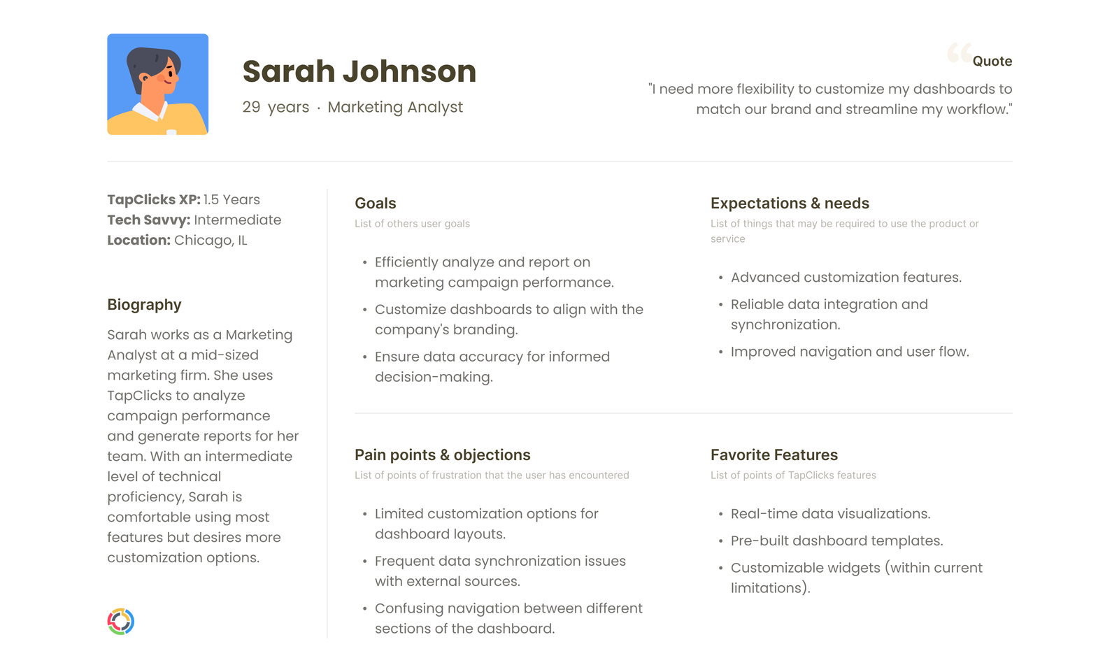
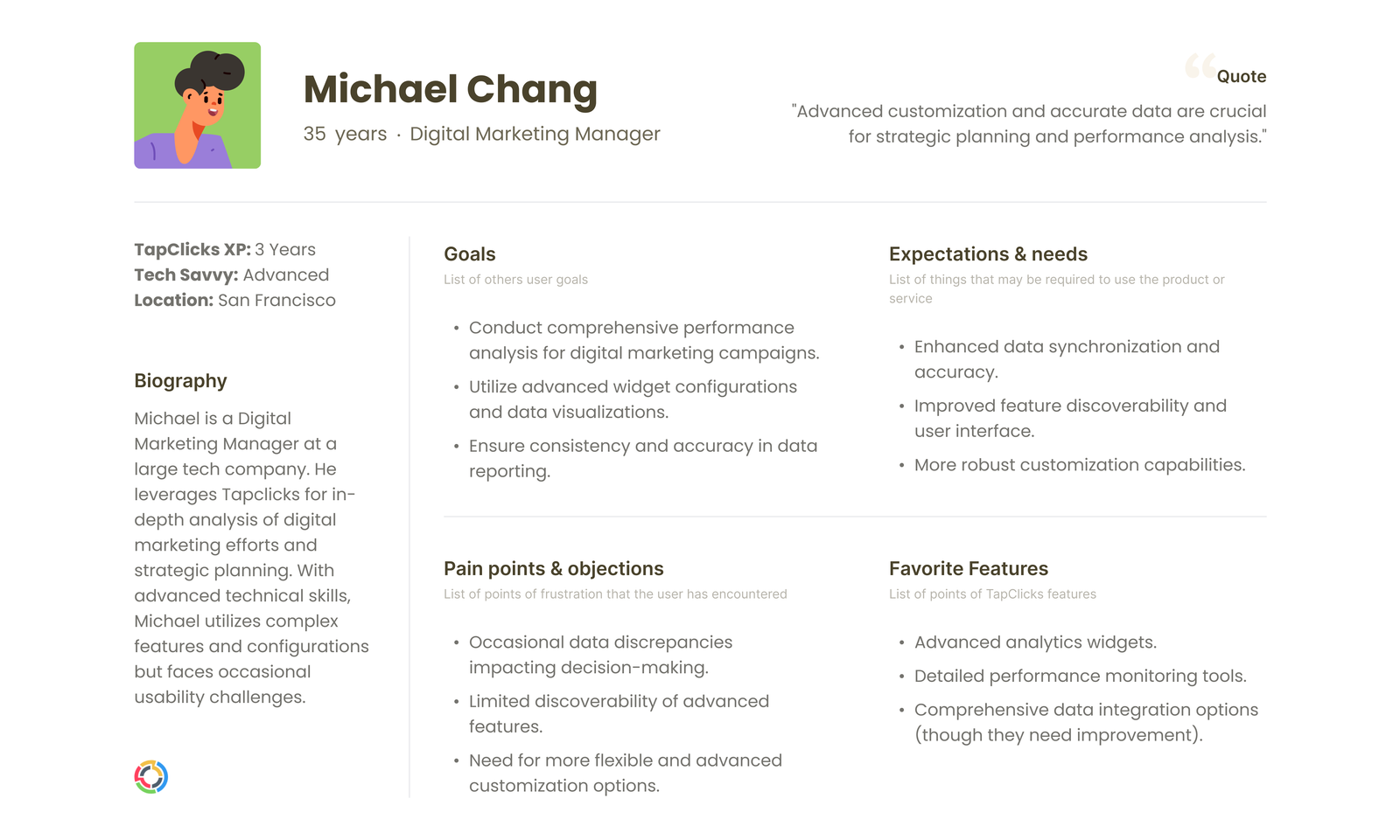
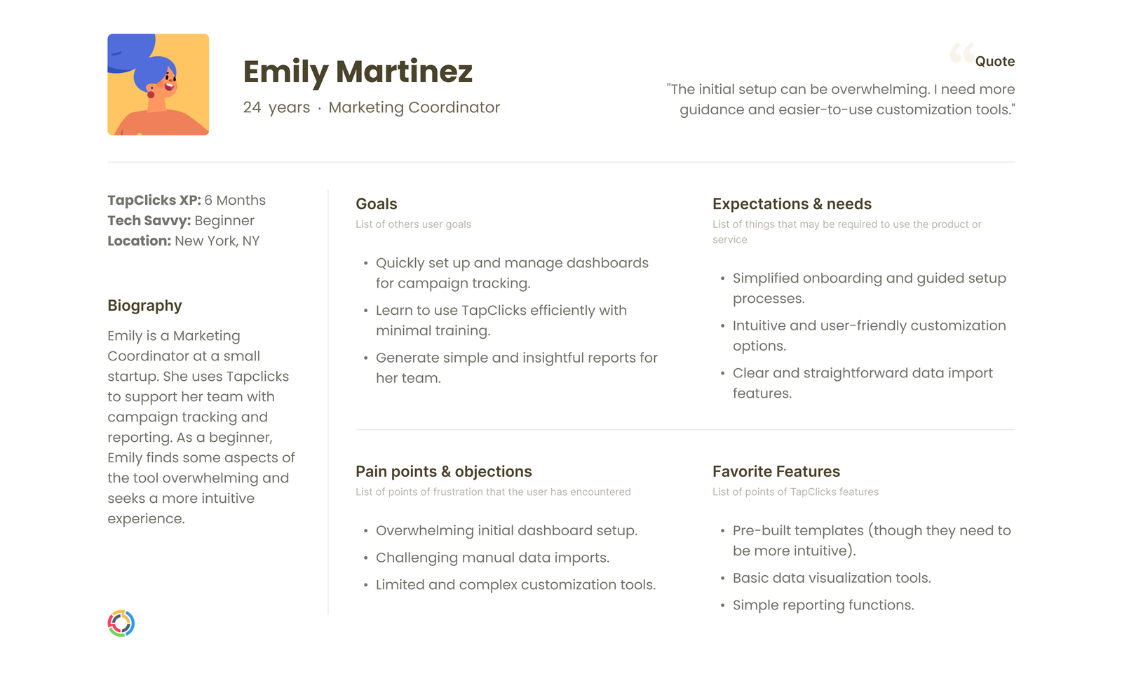
Personas
Mapping who we are doing these changes to.
User Story
"I want to be able to change the design theme freely"

Sarah Johnson
Beginner

Michael Chang
Intermediate

Emily Martinez
Advanced
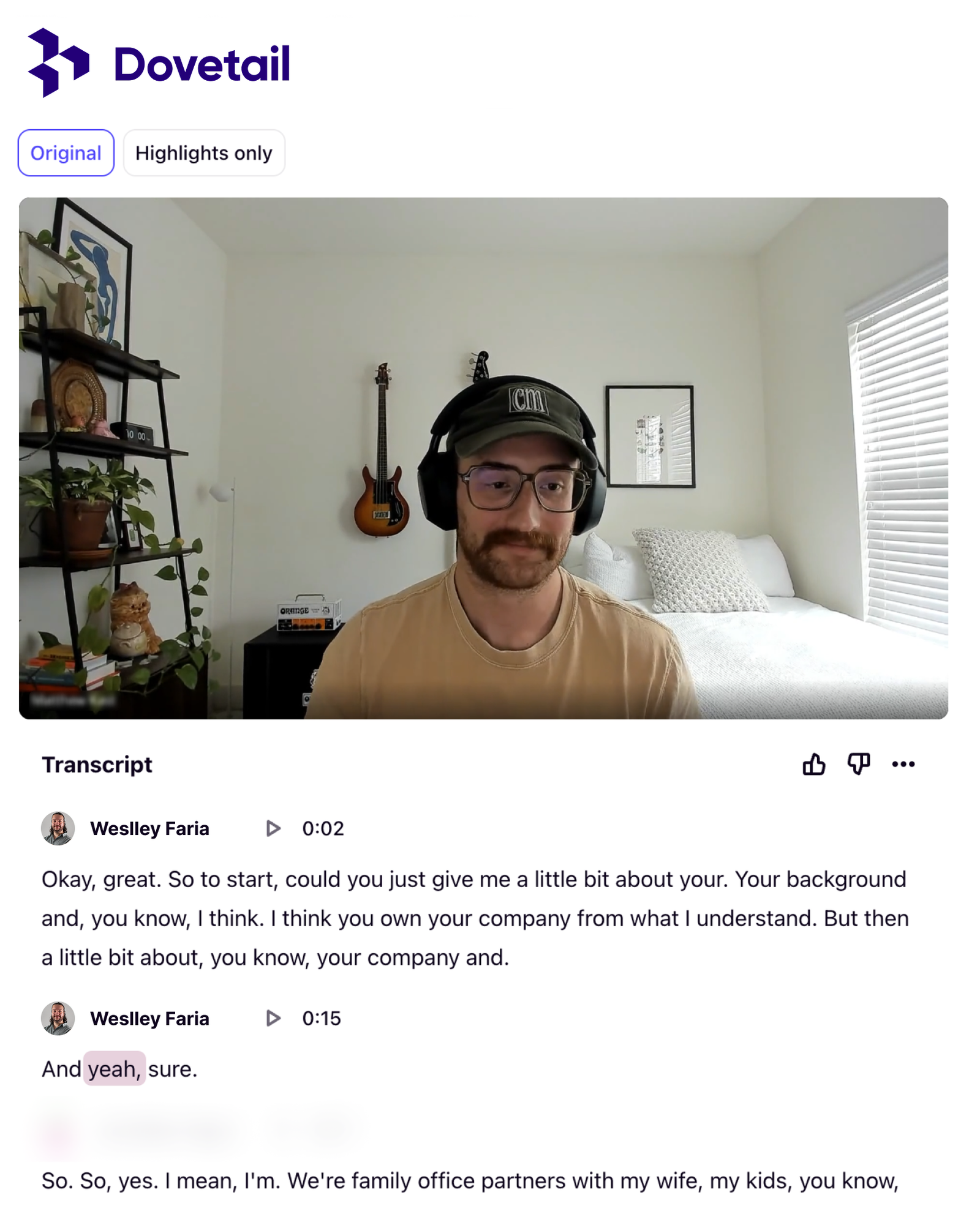
User Interview
Talking with our clients
User Story
"I need to add widgets fast while checking changes"
Beginner
Struggles with interface
Needs onboarding and guidance
Believes design is outdated
Intermediate
Struggles combining data
Needs better control and consistency
Requests for notification and importation
Frustation with broken flows
Believes learning curve is to high
Advanced
Struggles with data reliability
Needs advanced tools & flexibility
Requests for design freedom
Requests advanced tutorials
Workshops
Facilitating with my team
User Story
"I need to fast share dashboards links"
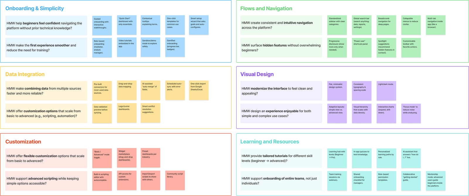
How Might We
Sensitive information have been removed!
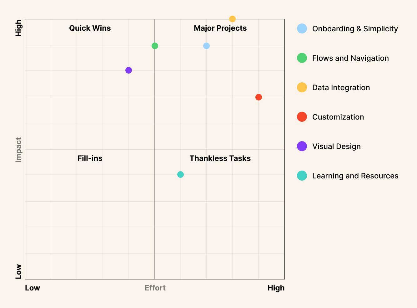
Impact x Effort Matrix
Guiding decision making
After this workshop, the team decided to work on the Visual Design, and Flows and navigation.
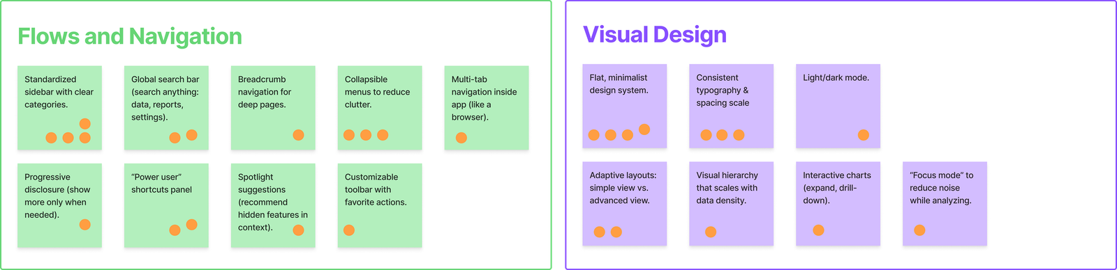
Dot Voting
Taking the decision
I facilitated a dot voting right after, so stakeholders could take the final decision.
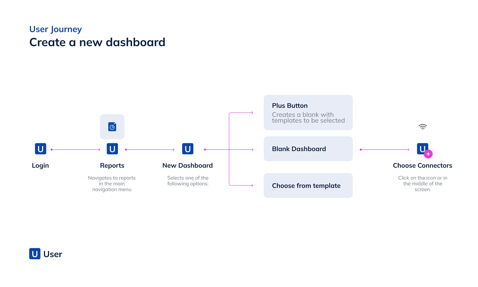
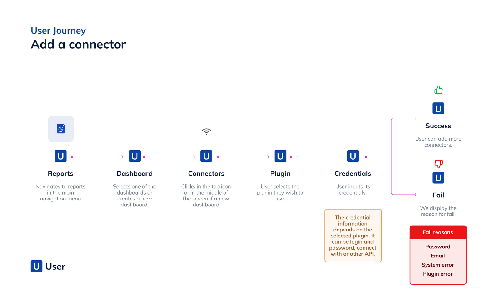
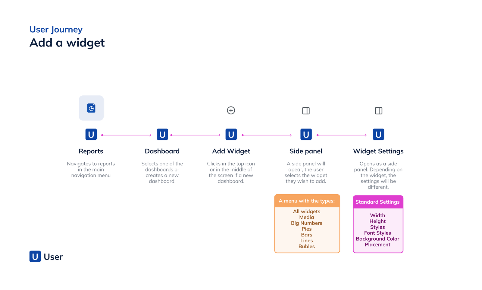
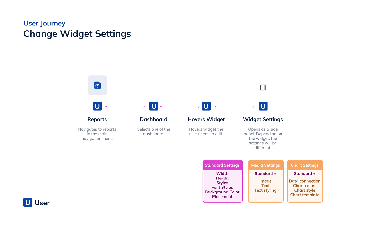
User Journeys
Main touch points showcasing the dashboards interactions
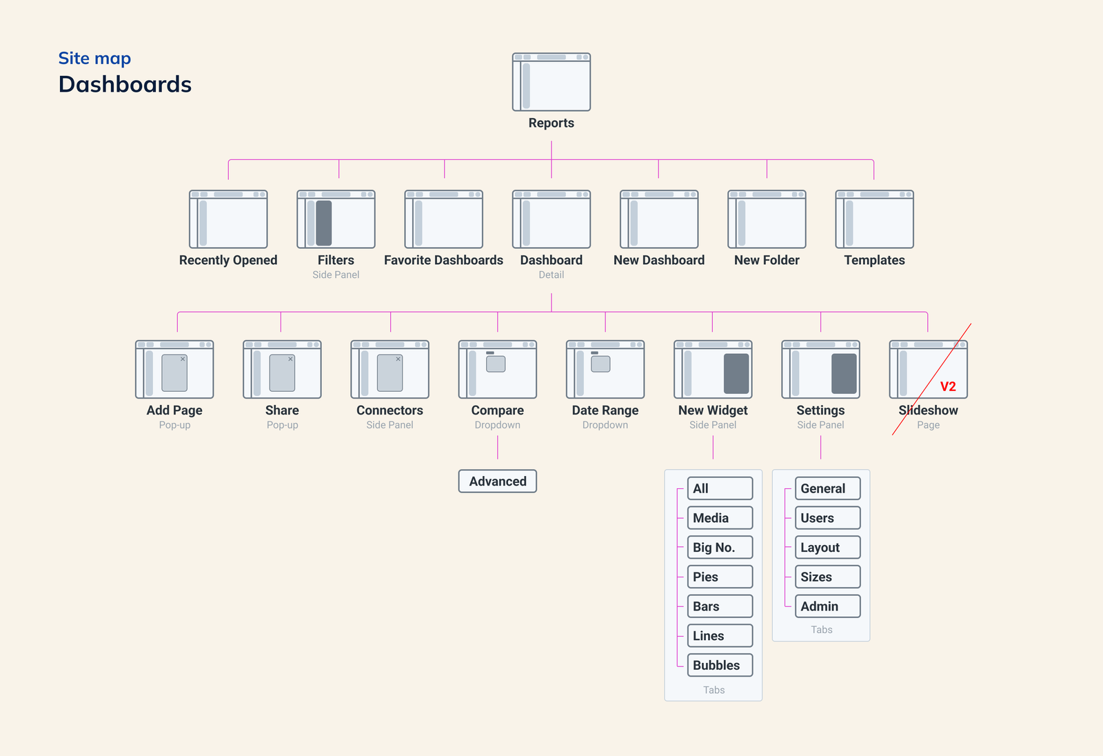
Site Map
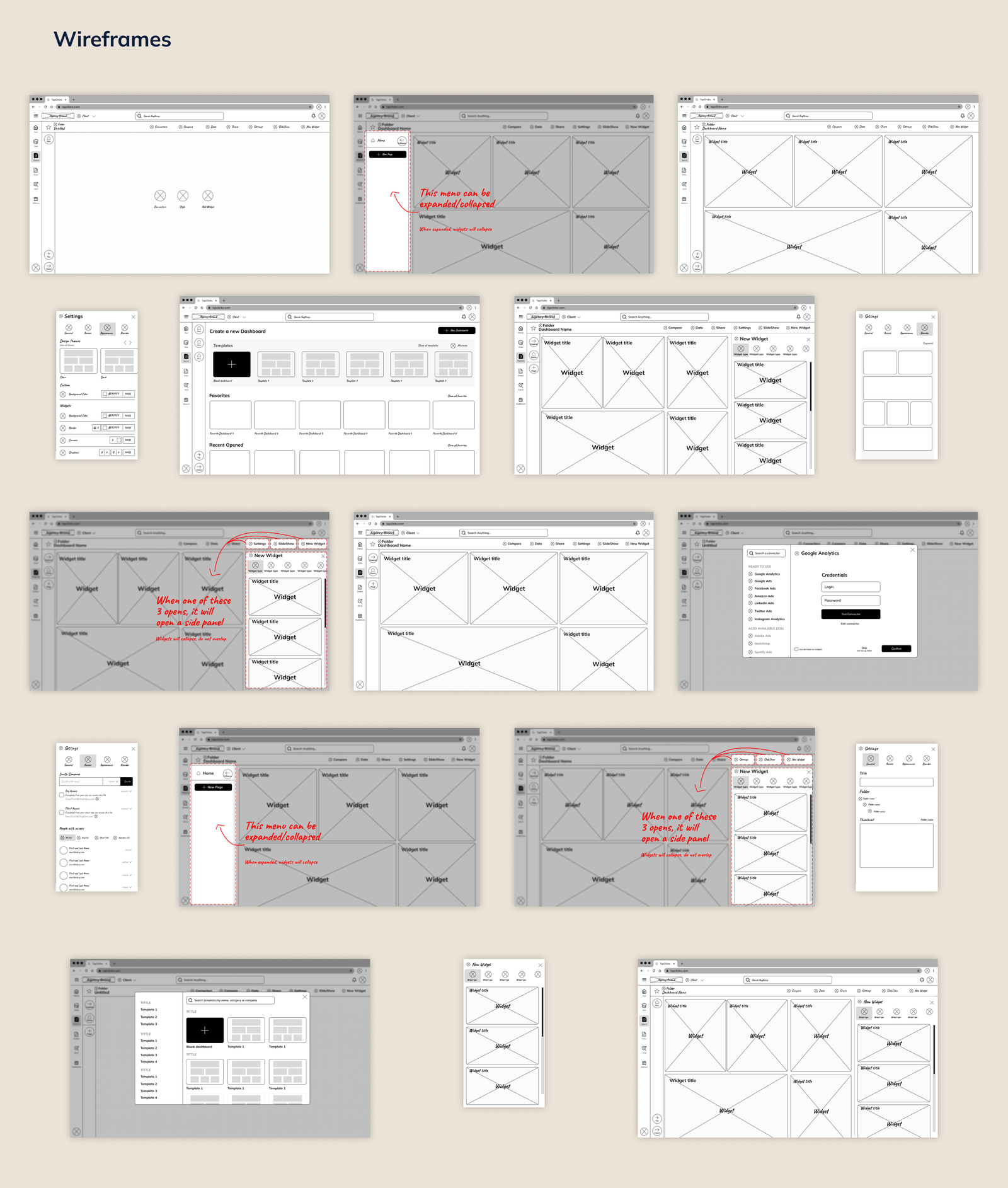
Wireframes
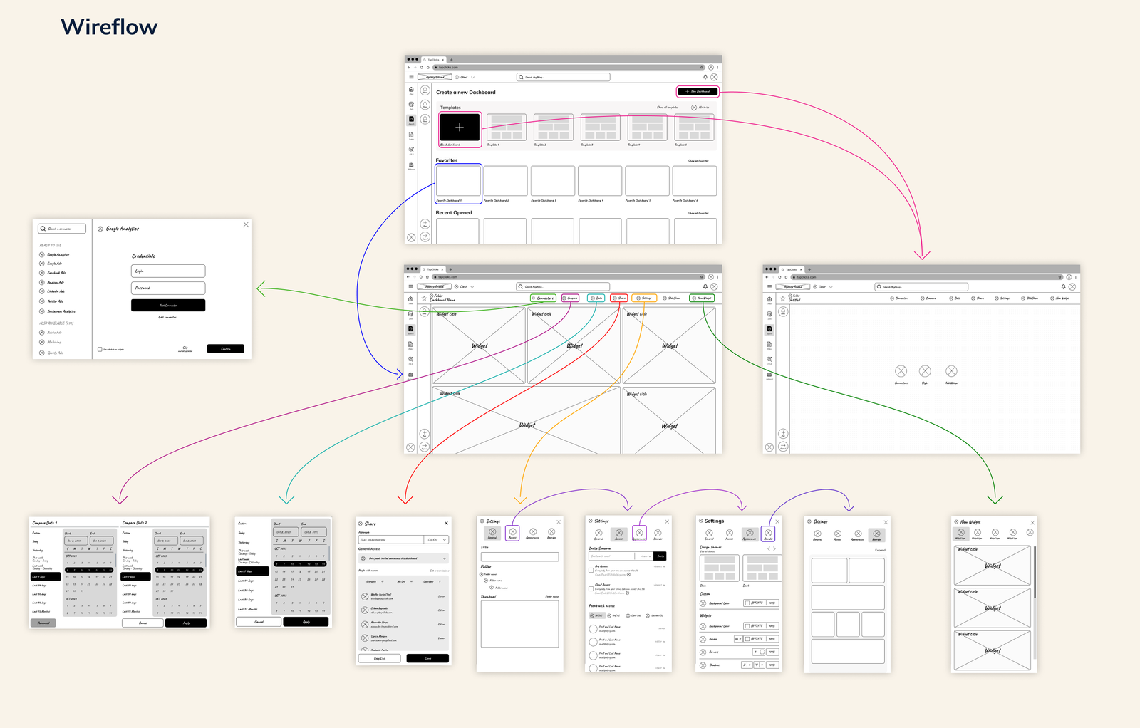
Wireflow
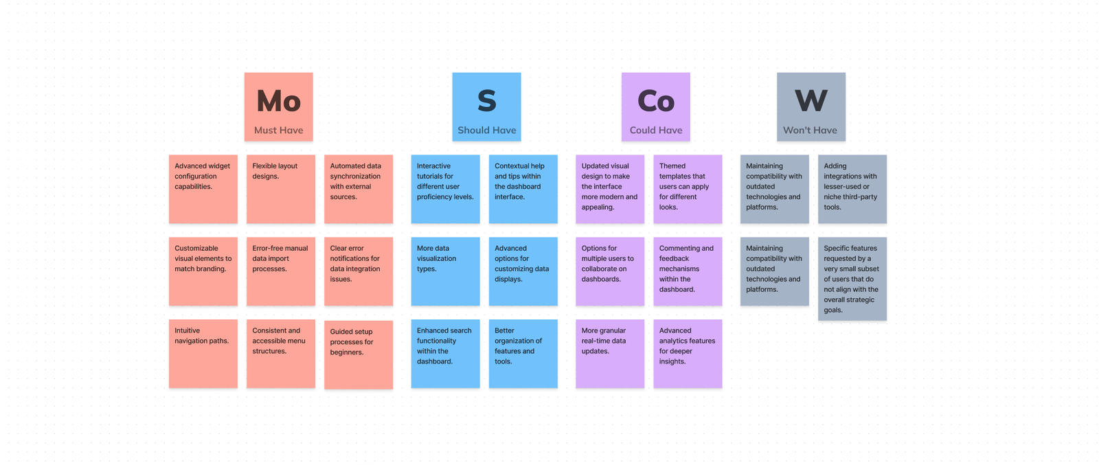
MoSCoW
After the wireframes, I socialized them and facilitated a workshop with stakeholders to decide what we would be doing or not, so I could start the high-fidelity prototype.
Outcomes
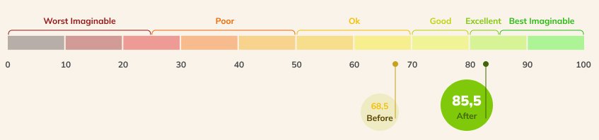
SUSSystem Usability Scale
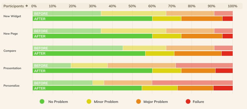
Task Success
Easy of Use
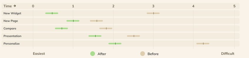
Time on Task
